From Artificial intelligence (AI) to being a data analyst in a firm, statistics is used in most of the lucrative careers. Analyzing data begins with its roots in statistics. Artificial intelligence (AI) is growing every day and with it, the Statistics surrounding the industry. Statistics data allow us to collect the information around the world which is used in fields varying from marketing to medical industry.
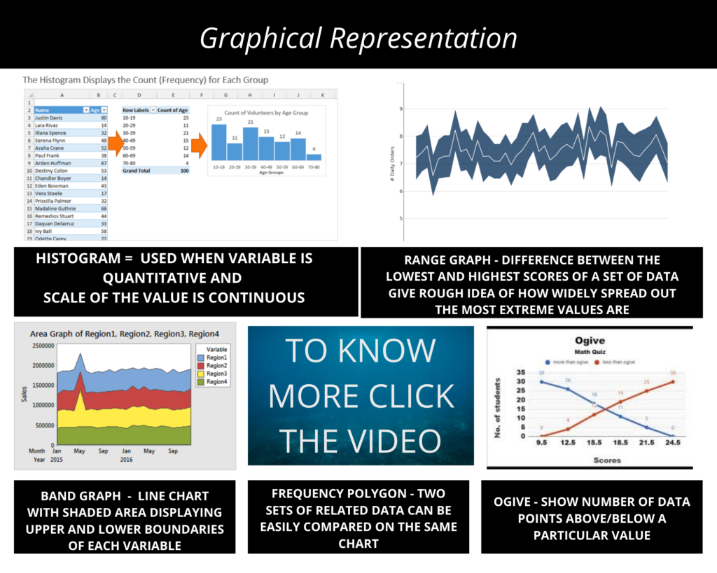
Different Types of Graphs
HISTOGRAM – Used when the variable is quantitative and the scale of the value is continuous
RANGE GRAPH – Difference between the lowest and highest scores of a set of data gives a rough idea of how widely spread out the most extreme values are
BAND GRAPH – Line chart with the shaded area displaying upper and lower boundaries of each variable
FREQUENCY POLYGON – Two sets of related data can be easily compared on the same chart
OGIVE – Show the number of data points above/below a particular value
For more detailed information on different types of graphs click the below video